
Love.Law.Robots. is moving!
You're browsing the original version of the Love.Law.Robots. Check out the new site. It's prettier and packs loads of new features!
Tune it up! Make it work!
 `
`
It’s not been very long since I did the post trying to [summarise the decisions made by the PDPC in one graph][/my-review-of-data-protection-in-singapore-in-one-graph/]. Just to do a recap of that post, I created a chart showing the “ups” and downs” every month.
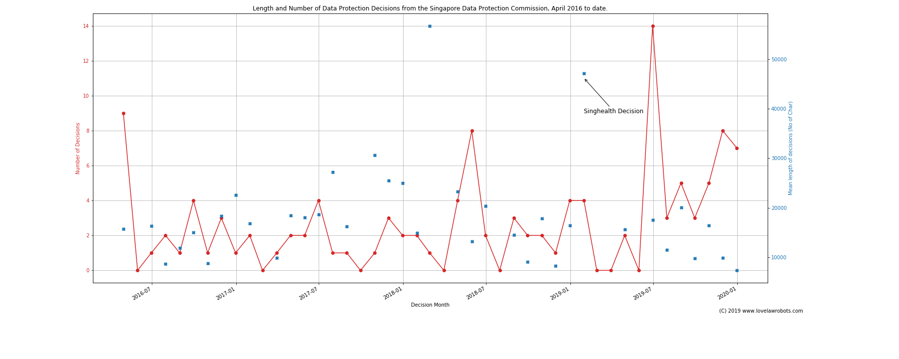
Wow wee… This is a line graph.
In the meantime, I have been brushing up my data plotting skills. I had qualms about that chart:
- It doesn’t really show a yearly state. As I did in the previous post, I used the SingHealth decision to mark 2019. That’s way too subtle.
- It’s not obvious to see where the norms are. If you looking for long decisions, you might find it. However you are probably very distracted by the red lines.
- Total quantity isn’t really obvious on a month by month basis.
I am happy to note that I have improved the chart! Look below now!
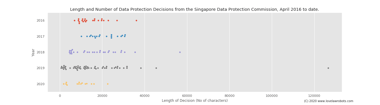
Now they are like little stars in the grey graph skies.
I am happy to note that the chart now shows the conclusions I wanted to make in the original post: (1) Decisions are getting shorter, meaning they serve less to educate than to highlight. (2) There were far more decisions in 2019, showing that educating on principles or ideas have become far less important.
The great thing about programming a chart is that the computer just does its thing whenever there is a new decision. As you can see, the decisions in 2020 seem more similar to the profile 2019 than any other year. I created them by automating the data collection process and coding the table in my notebook.
So what’s next?#
It’d be great if there was a static website where you can just visit to find the latest information rather than having me post it on this blog every time there is something. To be honest, it’s something I am working on! To be honest, it’s gonna take a while too.
Are there other ways I can improve these graphs? Any kinds of information you would find interesting? Feel free to comment to let me know!